THE TEN BOOKS ON ARCHITECTURE-(VITRUVIUS)
- 1907group1no3
- Aug 17, 2019
- 2 min read
Updated: Sep 18, 2019

As an architect, I believe beauty, symmetry and proportion are the things that separate the great architects from the good ones.
There are a lot of guidelines that help architects engineer their creations, one of the more famous being the Ten Books on Architecture, authored by the Roman architect Marcus Vitruvius Pollio. It is the only work on the subject to survive antiquity, and is highly regarded as a canon of classical architecture.
Vitruvius believed that central to every architectural design were three virtues – Firmitas (strength), Utilitas (utility), Venustas (beauty). He argued that these virtues could be learned from observing the human body, and emphasized the correlations between the body's symmetry and proportions with that of temples, believing that the body to be a perfect model and living rule book.
The book demonstrates that the ideal human body, by design, is symmetrical and proportional. The face, and the open hand being a tenth of the body's height; the head from the crown to the chin being an eighth; and the neck and shoulders to the lower roots of the hair being a sixth. Likewise, every member in the body has their own symmetrical proportions.
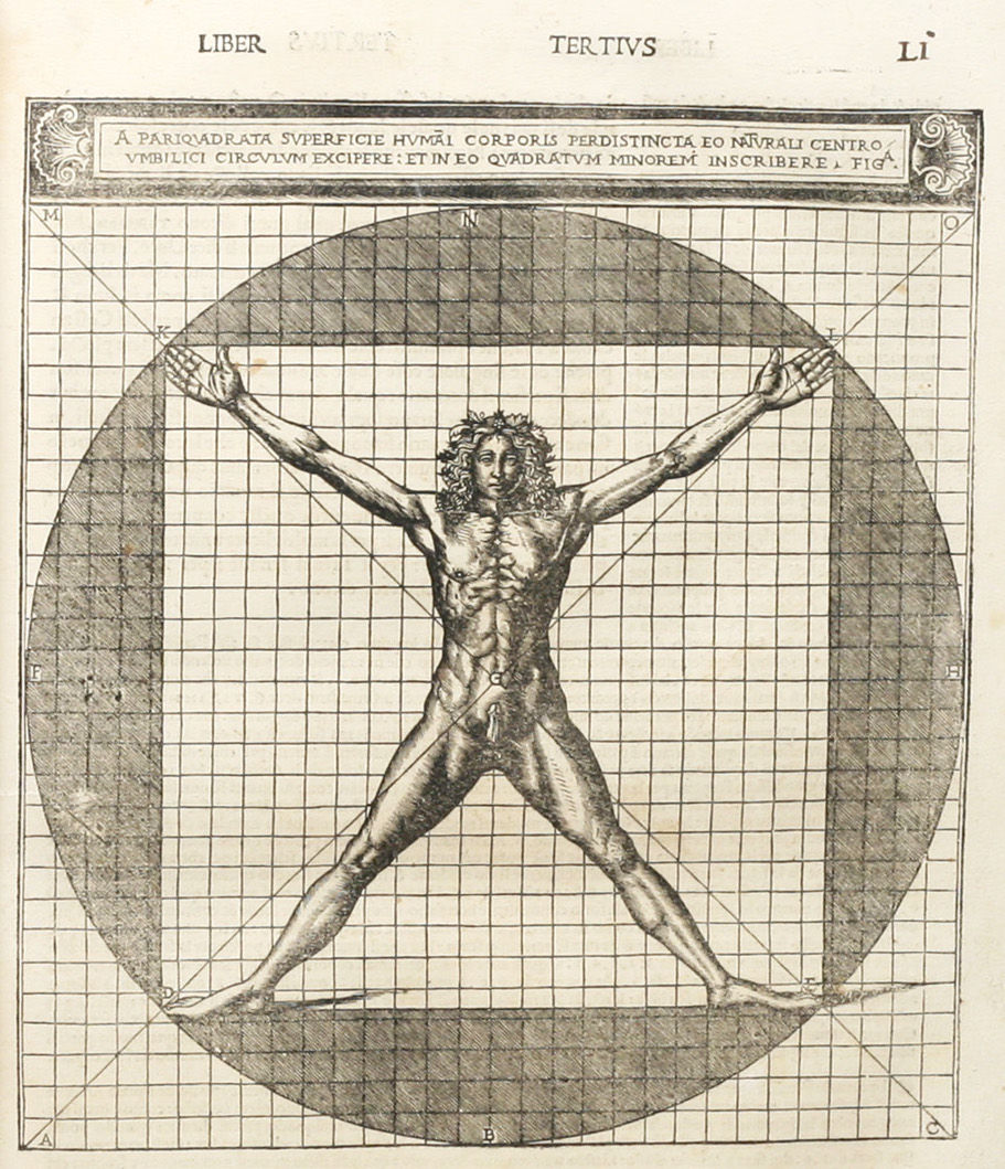
It also demonstrates that the navel is naturally placed as the central point of the body, for if a man lies on his back and extends his hands and feet, with a pair of compasses centered on his navel, a circle can be drawn touching his fingers and toes with its circumference.


The body can also form a perfect square, for with his arms outstretched, the length will be the same as from the top of his head to the soles of his feet.
He argues that, like the body, every individual member of the temple should have symmetrical and proportional harmony with one another. In the case of columns, for instance, in araeostyle temples, the thickness of the columns should be one eighth part of their height. If the distance between the columns increase, so should the shafts of the columns in thickness.
He also lays out principles for the diminution in the top of a column. If, for instance, the column is fifteen feet or under, the thickness at the bottom should be divided into six parts, with five of them forming the thickness at the top.
The taller a column is, the more they deceive the eye when viewed from below, and therefore, more must be added to the thickness where appropriate.
These are a few among the many guidelines that Vitruvius has laid out. As he said, the eye is in constant search for beauty. Gratifying it with the beautiful symmetry and proportion found in the human body will result in a design that is strong, useful, and beautiful.
SAFIA HASSAN ABDELHAMED HASSAN
1001542172


Comments